Advantec’s senior UX designer Joe Parker takes a look 10 examples of awesome ecommerce usability and explains the thinking behind them. Here’s his first five, with the next five on the way next week…
Protest
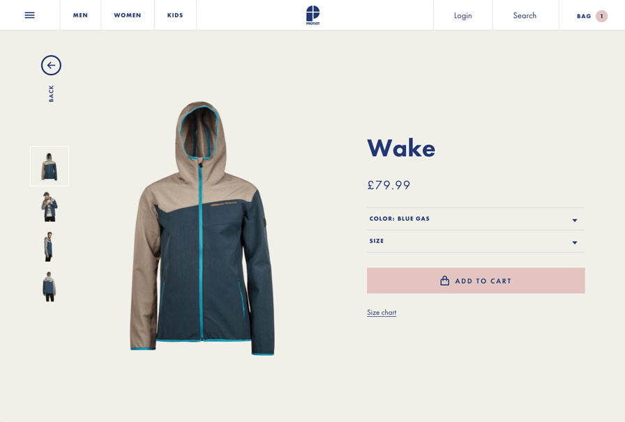
Protest.eu is one of my favourite sites from a usability perspective and packed full of UX charm. Designed with a ‘mobile first’ approach in mind, the site only displays the most vital of information, with further detail being stored behind efficient animation giving it a clean and appealing appearance which responds fluidly on devices.
The navigation on the site has been well considered, splitting products into ‘Men, Women, Kids’, when hovering over ‘Kids’ an animation reveals further sub categories, concealing the logo to accommodate them, so the customer doesn’t have to think too much.
Interestingly there is a burger menu along side the aforementioned navigation elements however, on desktop, this seems to be reserved for non product based links only.
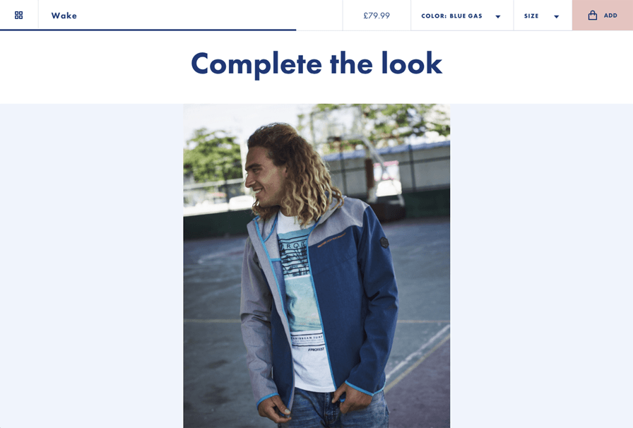
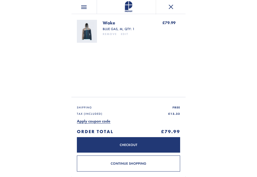
Another element that I loved appears on the product page, on scroll the header is replaced with a brief summary of the product and configurable options, which allows the customer to quickly choose a product and add it to the basket instead of scrolling all the way to the top of the page.
Amazon
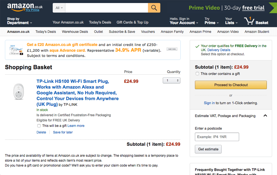
The ecommerce king, Amazon, has some beautiful UX considerations on the basket page of the site, including the ability to sign in for ‘one click’ ordering, which not only makes the purchasing experience almost painless for the customer after entering delivery and payment details but also tempts customers to start an account.
This page also has a nice little bit of functionality allowing the customer to enter their postcode for an estimate on postage costs, again saving them time in what can be a frustrating process on occasion.
Bulk Powders
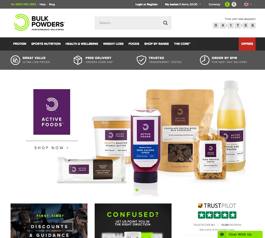
Bulk Powders is a Magento site full of interesting UX elements focused on increasing on-site conversions.
Taking a look at the home page we can see that a useful ‘time until next dispatch’ element is contained in the top right of the site, creating a sense of urgency, making it more likely that customers push through their order sooner rather than later to meet dispatch times.
A set of 4 trust icons can be seen with simple accompanying text below the navigation. Trust icons are a great way to build confidence in potential customers, increasing the chance of keeping them on the site.
Another example of trust reinforcement is ‘Trust Pilot’, the widget can be seen in the bottom right of the homepage screen, it displays a score, star rating and reviews, based on unbiased customer feedback, independently of the site, which builds trust in the customer through transparency.
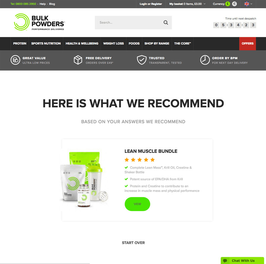
Another great UX element to this site is the product selector, which links through from the homepage. Choosing the right type of product in this sector can be confusing, so the guys at Bulk Powders have put together a handy and elegant interactive questionnaire to hone the customer down to the product that would best suit them. A great bit of personalisation which again builds trust in the customer, through the ability to convey knowledge.
Cineworld
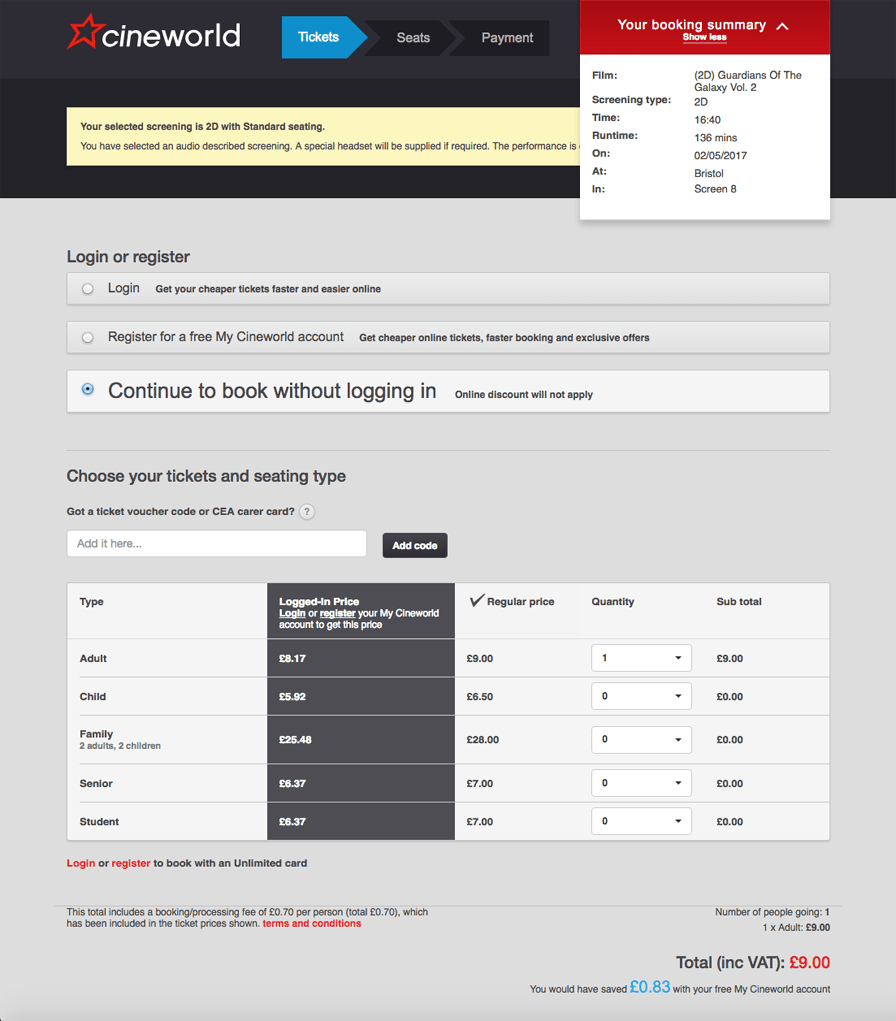
A trip to the cinema is a joyous occasion, reclining seats, all the food you can eat in 2.5 hours and the joys of Dolby surround sound. However, purchasing a ticket to a film of your choice has always been frustrating in my experience – until cineworld.co.uk
From the outset the site sets the mood with a cinema feel and as soon as you select a film the header swaps out for a tidy 3-step checkout process as highlighted by the visual indicator.
A useful expanding booking summary can be seen in the top right of the page, this stacks with information the deeper into the process you go, ensuring that the customer can feel comfortable in their selection.
The ability to book online without logging in and a time sensitive checkout all increase the chances of an online conversion through time saving/time pressure techniques.
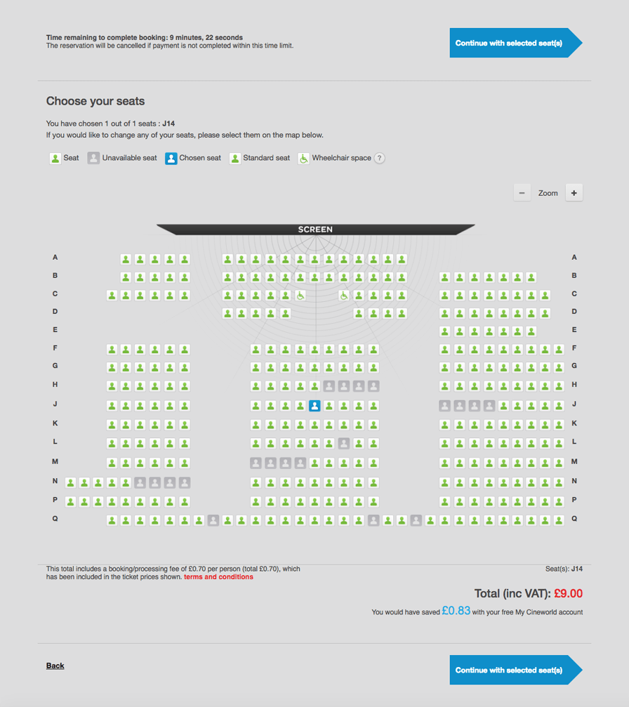
Another cool element is the ability to pick exactly where you will be sat in the cinema on the interactive seating plan, taking the pressure off the customer having to decide at ticket collection, a neat UX addition to the process.
B&Q
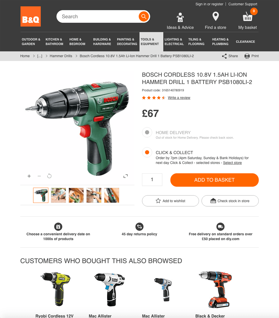
The big boys of the DIY world B&Q, are constantly evolving the UX on their site, aided by huge amounts of user testing data, so they can be a pretty reliable indicator of what to look out for in the future.
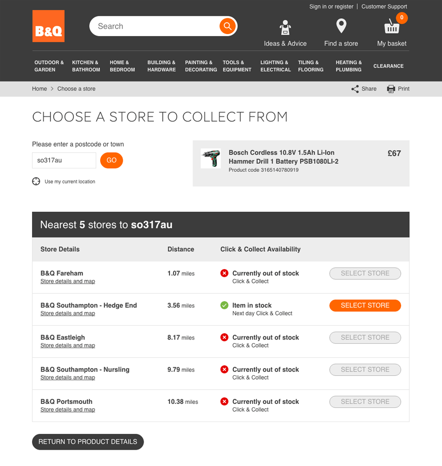
There are two specific elements that I love on the B&Q site, firstly the design of their ‘Click and Collect’ process. The customer can simply select one of the radio buttons ‘Home Delivery’ or ‘Click & Collect’, then the ‘Add to Basket’ call to action at the product detail level, this then opens up the next screen which determines a pick up location through a simple postcode field, this can also be amended in basket, nice and simple.
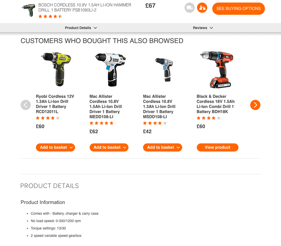
The second UX element that improved the experience was the minimised product information on scroll of product pages, this differs slightly from protest.eu in that there are also anchor links to help the customer quickly access page information, saving them time searching the site.
To be continued…
Keep an eye on our blog for the second instalment of Joe’s blog post next week.
Joe Parker – Senior Designer