In the second instalment of his ecommerce usability blog, Advantec’s senior UX designer Joe Parker takes a look at five more examples of awesome ecommerce usability and explains the thinking behind them.
Nixon
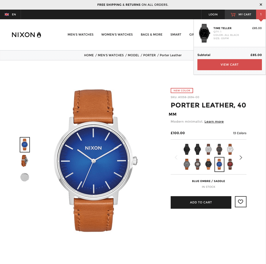
Nixon are in the business of selling luxury watches; their site exudes quality through the use of a minimal interface, bold enticing imagery and a mobile first approach, making the customer feel that they have all the time in the world to explore the site, without feeling bombarded with information.
The product page contains a thumbnail images of the alternate product colours, saving the customer the time of cycling through a dropdown list. Bold imagery and a clean considered layout simplifies the decision making that needs to be done at this stage.
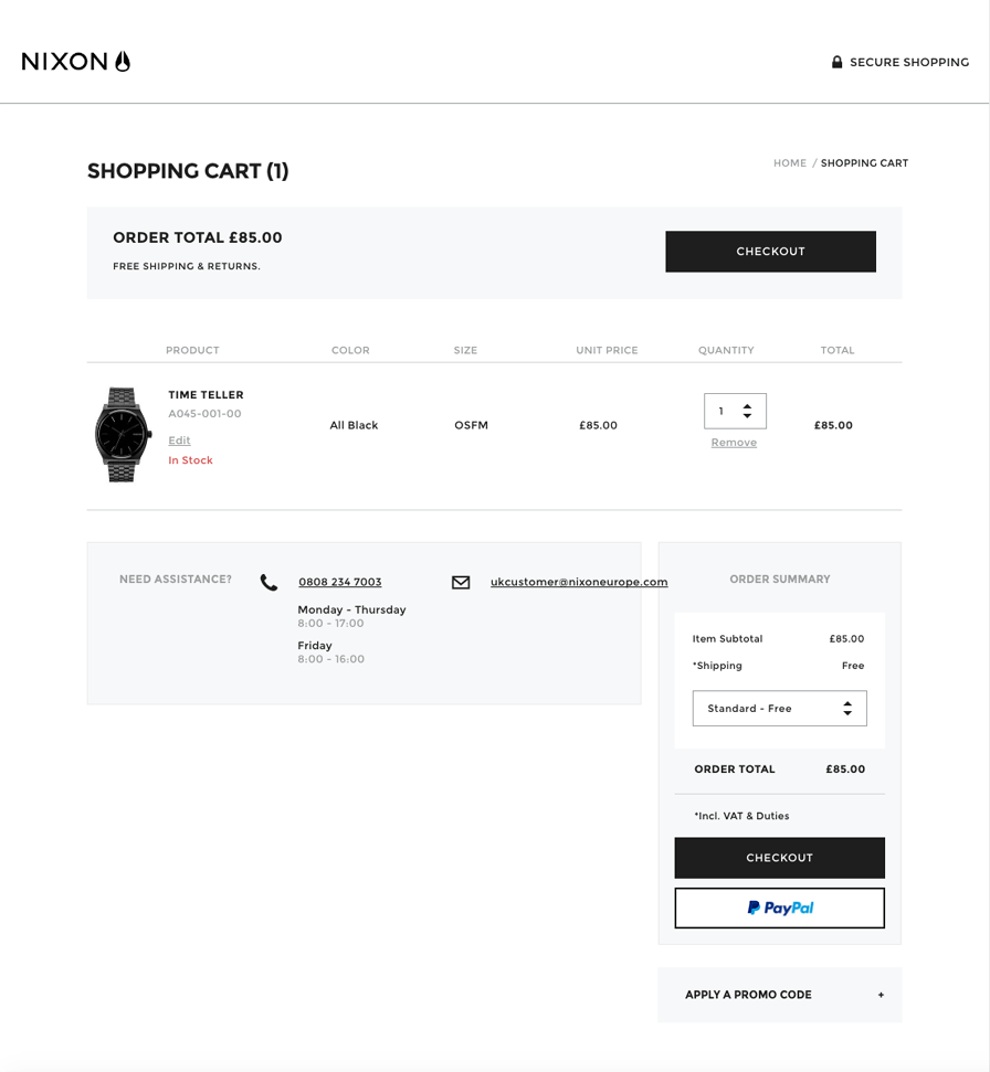
An enclosed checkout encourages customers to complete the purchase, reducing the chance of abandoning their basket by clicking off of the checkout screen onto other sections of the site.
Gusto
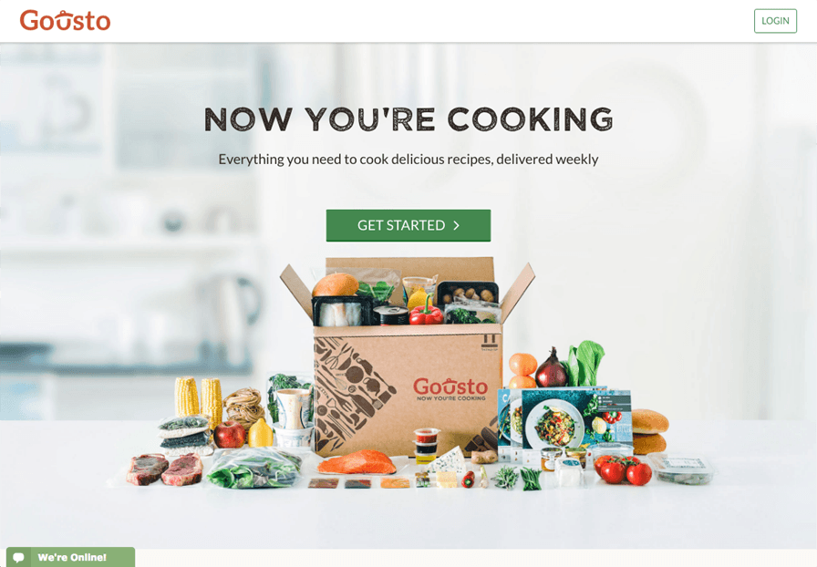
Gousto is a service that offers recipe kit boxes, delivered with fresh ingredients to your door.
Interestingly when first visiting their site, the customer is presented with an enclosed header and a simple 3 question journey to customise and tailor the experience, this gently focuses the customer on a few key decisions, such as number of people the boxes will need to cater for, post code for delivery and the delivery date. By this point the customer has already provided most the information to get a box delivered and all that remains is to select their recipes.
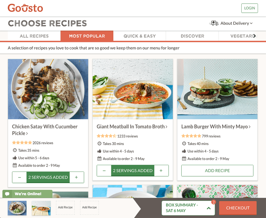
The selection of recipes is well considered too, with clear horizontal categories. The recipe cards display reviews, cooking time, availability and the functionality to add recipe for the catalog page.
Interestingly the basket summary and checkout have been anchored to the bottom of the page, there is a growing argument about this being more suited to mobile users and more accessible to click, a trend that we may see more of in the future.
Beats
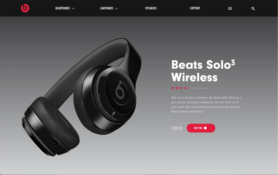
To sell a high end product, beats show that they can afford to be luxurious with the space on the site, which in turn entices the customer to scroll through with the help of techniques such as the use of a simple clean grid, bold sans serif typography and high end imagery.
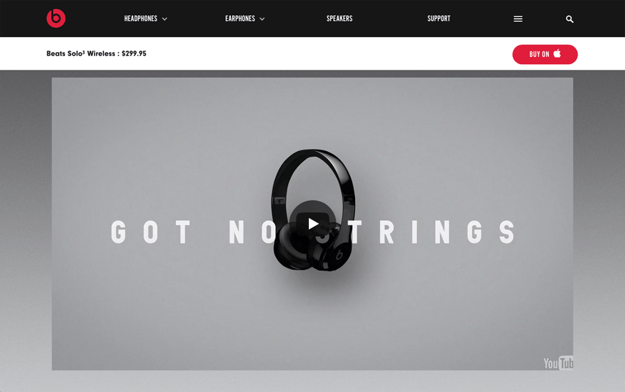
Beats split the product page into a powerful yet simple selling tool, each section is carefully considered with configurable interactions dotted elegantly throughout, such as colour choice. Full width video has been included to make the product more tangible and appealing.
Much like protest.eu the product title and ‘buy’ button appear on scroll so the user is never too far away from making a purchase if they wanted to.
Ikea
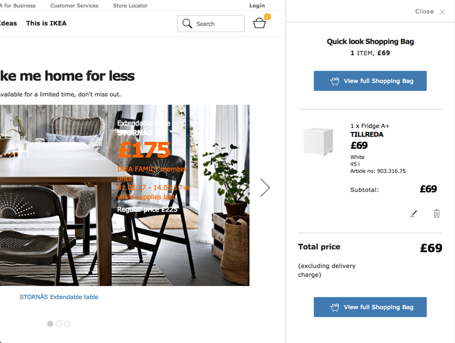
For the flat pack giant ‘Ikea’, a store with an enormous product range, their site is incredibly simple and elegant. It would have been very easy for this to become very cluttered and messy, however they overcome this through some interesting UX considerations.
Firstly, the site has been designed with a mobile first approach, elements such as the basket have an efficient push animation interaction to focus attention on the active element.
Secondly, the abundant use of white space and a subtle, wire-like UI makes the site very appealing by reducing visual noise and helps to focus the customer on the item that they are looking for.
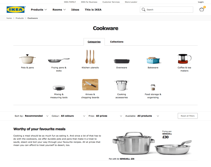
Category and subcategory pages make use of the full width grid by making the left hand filters horizontal. This makes the page feel less cluttered and allows more products to be displayed.
Categories & collections are simply displayed at the top of the catalog page in a tabbed format with a focus on product imagery; this helps to free up the page too.
Trespass
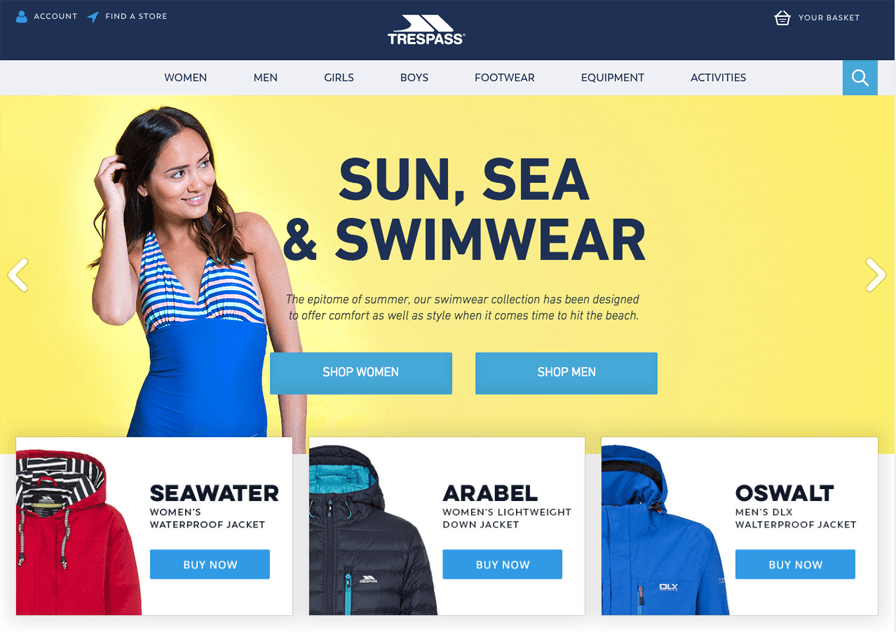
Trespass is another great example of mobile first design, the homepage has simple and attractive sign posting which allows the customer to drill down to the product that they are looking for quickly.
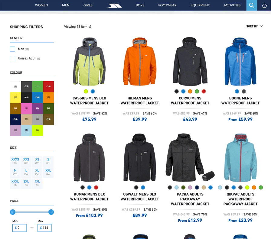
The catalogue page has some interesting UX considerations such as the ability to configure the colour of the product very simply and visually on the product card itself, making it one less decision that the customer has to make on the product page, increasing the chance of a conversion.
Now that we have seen the various usability considerations and techniques that UX and UI designers have made to improve the customer journey, I hope that you will agree that UX can be the key to success on a website and as UX and UI designers, we all have a responsibility to listen to both the customer and client in order to design tailored, pain free, time saving experiences which are a joy to use.