Don’t be so slapdash.
For those who are just getting started with web development and want to do it properly.
Forenote
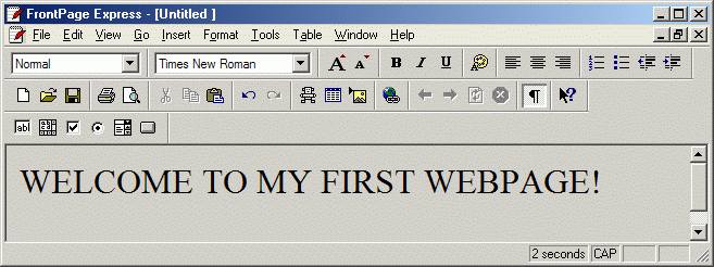
My name is Laurence. My passion for the web started in 1995 when I discovered a WYSIWYG editor hiding alongside an installation of Internet Explorer; it was called FrontPage Express.

Finding that bit of software whilst browsing the files on the family computer was a dawning moment in my life. I realised I didn’t need hundreds of pounds, to be Bill Gates or to have a degree in computer science to make a website; anybody could.
I was 12 years old and I could make a website. I could upload something from the family computer and someone on the opposite side of the world could access that something immediately. That fact is amazing. It blew my mind. It still blows my mind.
After a little tinkering with FrontPage Express, I discovered a hidden layer of markup and inline styles underneath the visual WYSIWYG output. I tinkered some more.
I soon realised that what works for me doesn’t work for everybody. Whilst doing some field testing (aka. asking a cousin if they like my site) it was apparent what I was seeing wasn’t what they were. It was a mess on their screen but pixel perfect on mine. Why? A different monitor with a higher resolution was the reason.
I now had to consider so much more than fixed pixels and aligning to the left/right of the viewport if I wanted my website to display as intended for everybody.
Continually trying new methods and techniques I became rather good in comparison to what was being output by professional studios. Pre-2000’s I hadn’t considered progressive enhancement but I did always ensure my work would render correctly on any browser that was available.
Flash and Shockwave were all the rage leading up to 2000 and I spent my time recreating web sites that were originally built in Flash; only I was building them in HTML, CSS and a little Javascript. I found this particularly beneficial as I learnt so much doing it. I’m not sure what the equivalent would be today. An alternative could be to take a website that doesn’t display correctly in Internet Explorer 8 and see what you can do to fix that. You could be surprised with how little effort it takes, hopefully you’ll be left wondering why the decision was made to develop it with those limitations in the first place.
I also hated the thought of a user requiring an additional browser plugin to view content; that’s as wrong (and annoying) now, as it was back then.

Over the years I’ve continued to hone my skill set and refine the quality of my work. I’ve always had the thought that I want to write my code as coherently as possible so interested developers could pick it apart and learn how I made something.
23 years later, I’m still truly in love with the web and what it has become. Although I’m now writing code as coherently as possible so a colleague doesn’t murder me out of confusion.
You’ll be pleased to know I’m not using FrontPage Express anymore, it sparked my fire but it was replaced relatively quickly.
If you’re interested I’ve been through a few development tools but in recent years; Atom with various extensions is my weapon of choice for development and Figma is my not so secret weapon for design.
Try them, embrace them; they are your friend.
What is Progressive Enhancement?
Put simply, progressive enhancement is about getting the core basics of a site working first, something that will just work no matter what browser or screen size the website it is being viewed on. Then you enhance it as and when necessary for newer and newer browser technologies until you reach today’s browser releases. Only enhance what you need to. Keep it simple.
Start by getting your HTML correct, then enhance it visually for the most basic of browsers.
Personally, I’m not targeting a specific browser – I’m simply using basic HTML and CSS that I know will work on any device.
If targeting a specific browser helps you understand this concept then go for Internet Explorer 8. Remember, it doesn’t need to be the most attractive but always, ALWAYS ensure the content is coherent on the old git. It could literally look like a word document. That would be perfect as long as it’s not broken and the user can get the data they came for.
HTML
Hypertext markup language is your first point of call when starting the build of any standard website, so why not get that bit perfect first. Put your CSS and Javascript on the shelf, you’re not going to need either; they’re enhancements and totally unnecessary for the web to function.
See the Pen HTML by Laurence Archer (@Ozpital) on CodePen.0
Why bother writing correct markup? Because that’s what the web understands, it’s beneficial to both humans (including those with disabilities) as well as other computer systems – especially those that power the search engines.
My point being; if you ensure your markup is accessible and correctly formatted (so everybody can get the information within your site coherently); you automatically give yourself a head start with any search engine optimisation too.
It’s not difficult to get your markup correct. Just think of it as a formal document that should read and make sense without any custom styling; just the basic styling built into the browser is enough to make correct markup legible.
Elements
There are multiple elements you can use to correctly markup your website; HTML5 especially brought with it a lot of elements to make your markup even more accessible. I’m not here to teach you how to write proper markup but you should definitely visit Mozilla for a fantastic and easy to understand reference of what elements are available and how to use them.
CSS
Once you have your markup written correctly, the next step is to make it beautiful.
We use Cascading Style Sheets to enhance the default browser styling. Yes, that’s right; styles are an enhancement of your HTML. They are not the same thing. They are not one. They are separate. Treat them that way.
These days we can do some crazy things with CSS, including animation but fundamentally; styles are used to enhance your website’s presentation. That’s all styles aim to do and they do it well.
Styles are where you really need to think about browser support. Start with the most basic, standard CSS properties for the core experience you want to deliver. Start with the small screen and work your way up to large displays using @media queries. Then enhance the layout with even more modern properties and queries.
To ensure simplicity don’t try to make a single HTML element do too much work.
See the Pen Pure CSS3 single element Link from TLOZ by Kevin Gimbel (@kevingimbel) on CodePen.0
Sure it’s nice to challenge yourself to see what you can do with a single element but for clarity and maintainability feel free to add a new HTML element to your markup if the job of one element is getting cluttered.
Keep it refined. Keep it simple.
Javascript
The second best friend of HTML; Javascript is not a tool to fix flaws in your markup or CSS, your website most certainly shouldn’t break without it. Your site should still function perfectly with Javascript turned off.
If your first thought on that last sentence was “nonsense – everybody has Javascript enabled, I don’t care about the few that don’t”, you should be ashamed of your ignorance. If I was an employer I’d show you the door, as it’s clear quality isn’t your priority.
Ensuring your site works perfectly before even reaching for Javascript is another example of enhancement. HTML and CSS do a great job without Javascript. It’s better for speed, accessibility, usability, maintainability and SEO if Javascript is used to enhance rather than be a dependency for your site to function.
With that in mind; Javascript is amazing and keeps getting better. It can take the default functionality of your site and improve it. It has the ability to make things really funky but the real skill comes in using the technologies under the Javascript title to make things better, more accessible and faster for the user.
That’s not to say there isn’t a place for ultra cool Javascript powered 3D animation – that stuff is jaw dropping but you must ask yourself when designing and developing for the web – who is benefiting from this thing I’m making fade, bounce, burp and dance? If it’s just you and the client, then you need to reign it in and rethink the project, the user is the priority.
Just because you’re a clever clogs who can do the clever bollocks, doesn’t mean you should to the detriment of the user experience. If an ajax lazy loader will improve the user experience by allowing text content and styles be delivered to the user before the images – then that’s a super good use of Javascript.
If you’re allowing the user to instantly sort and filter search results without reloading the entire page – that could also be a great user experience and another super good use of Javascript.
As always – the best results are when you keep it simple.
End
As with all things in life; practice will make perfect. You will progress and make better websites the more you create, play and develop them. Just don’t think you can take shortcuts with progressive enhancement, as you can’t. It may visually work but if you want to regard yourself as the best of the best then there’s only one true direction to take.
If you’re building for the web, for users all over the globe to access your work within seconds in the browser – you simply must adhere to the principles of enhancement. The information within your site should not be blocked because of a dependency you believe every user must have to view your amazing work. Nobody else cares that much and they will find an alternative source of the information they require – which will increase traffic to the alternative source and rank them higher in search engines pushing your project to the bottom of the pile.
What I fundamentally don’t believe is that progressive enhancement adds time to a project build… as it doesn’t.
As with most industries – some people are just doing a 9 till 5. Sure, they can make a website, but they don’t love it, it’s not their passion.
I’m passionate about the web development. I hope you are too. I hope to work with you one day.
I’ve worked with a few “Mr. Day Jobs” though. We all have. They’ll happily squirt out a project for the insta-gains and praise from their peers but will inevitably struggle with maintainability.
Their client wonders why their site doesn’t work on their investors old, out of date laptop, so fallbacks are implemented after much arguing about how “the investor needs to update their browser”. The fallbacks increase download time which in turn hits the sites SEO rank even more. Now the site is clunky rather than graceful. Now it’s a chore rather than a joy for Mr. Day Job to work on the project. The project fails. The client is unhappy. Mr. Day Job moves on to his next project.
It’s all a time consuming, bloated way of working that introduces larger issues. If the project was initiated with progressive enhancement the end result would be more polished, more refined, faster, leaner, more accessible and easier to maintain out of the box.
Everybody wins with progressive enhancement.
Keep up the good work.
Laurence Archer; Advantec