To quote the late, great, fashion designer Alexander McQueen:
“As a designer, you’ve always got to push yourself forward; you’ve always got to keep up with the trends or make your own trends. That’s what I do.”
McQueen points out the paradox of a designer, on one hand, you must stay relevant and current by keeping up with existing trends and on the other, you must also push the boundaries and explore new creative routes.
Without further ado, let’s take a look at some of 2018’s tipped design trends.
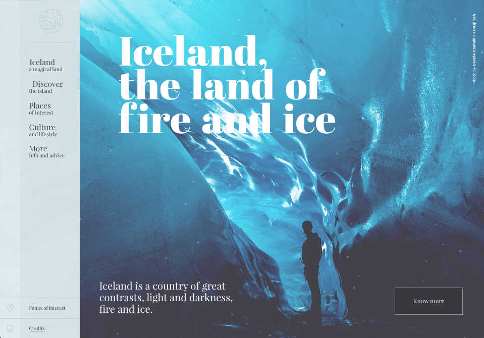
Double exposure
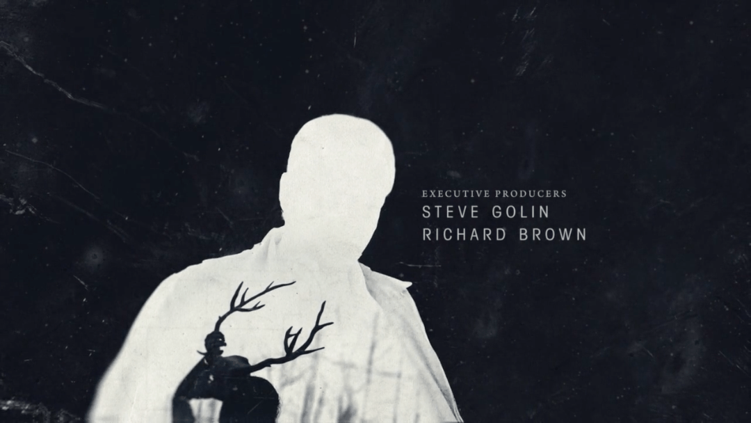
Double exposure is a photographic term, it is a combination of two or more exposures, resulting in a single image, traditionally it was created by opening the shutter on the same piece of film to different images, it was a popular technique to fake ‘ghost’ sightings in the 1800’s. Thankfully in 2018, everything can be faked, including the road to presidency apparently, so you will be happy to know that the wonders of Photoshop allow you to create this effect relatively quickly through a few simple blending mode and clipping mask steps.
I believe the popularity of this trend rose from the hugely successful opening title sequence of True Detective – Season 1, which plastered our screens with beautiful double exposure compositions in the opening credits. Inspiring designers to explore this technique in their interface and print designs. Combine this effect with type and you have the ingredients for some really interesting creative outcomes.
Two colour gradients
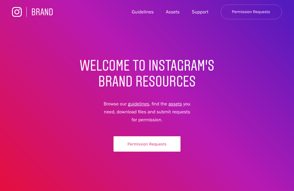
Any mention of the word ‘gradient’ used to conjure up flashbacks of the skeuomorphic web design of yesteryear in the mind of an interface designer, however, they are making a bold comeback for 2018 in a more subtle and attractive form.
This trend has been making a creeping comeback for a couple of years with Instagram spearheading the way with their brave gradient based rebrand and 2018 is the year where we are set to see this trend really make an impact across interface designs. The gradients differ from their earlier counterparts in that they are more gentle and inviting, using a narrower gradient between material design colours, a palette which was defined in Google’s popular material design guidelines, resulting in a more ambient and engaging experience.
Semi-flat design
Over the past 5 or so years, realism and skeuomorphism have been surpassed by the ‘Flat design’ movement, influenced by Swiss design, Modernism and the Bauhaus school of design, focusing on usability and simplicity.
It had so much of a cultural influence that huge household name brands were dropping their 3D realistic logos for a cleaner and more minimal, flat alternative (Netflix, Paypal, Airbnb).
Flat focused on minimising the illusion of stylistic 3D elements on a design (drop shadows, gradients and textures), in favour of simplicity in typography and colour palette, this resulted in designers being able to create aesthetically pleasing interface designs which convey information quickly and efficiently focusing on a hierarchy of information. As more and more interface sizes popped up to view digital interfaces on, the flat movement lent itself perfectly to flat design as it made the task of responsive design relatively painless for the designer.
In 2018 flat design is still going strong however we are beginning to see the reintroduction of subtle gradients and shadows in interface design, pioneered by Google’s material design philosophy, designers are coming to realise that the use of these stylistic elements (if used minimally and subtly) can be hugely useful in asserting hierarchy on a design, this movement has been called ‘Semi-Flat’, shadows are deep and soft and gradients are subtle and ambient. Although these stylistic elements are rooted in realism, they can still thrive under the banner of ‘Flat Design’ as they help to promote its core values of simplicity and usability, so expect to see semi-flat designs enhancing the depth of your experience of interface throughout 2018!
Animation & Gifs
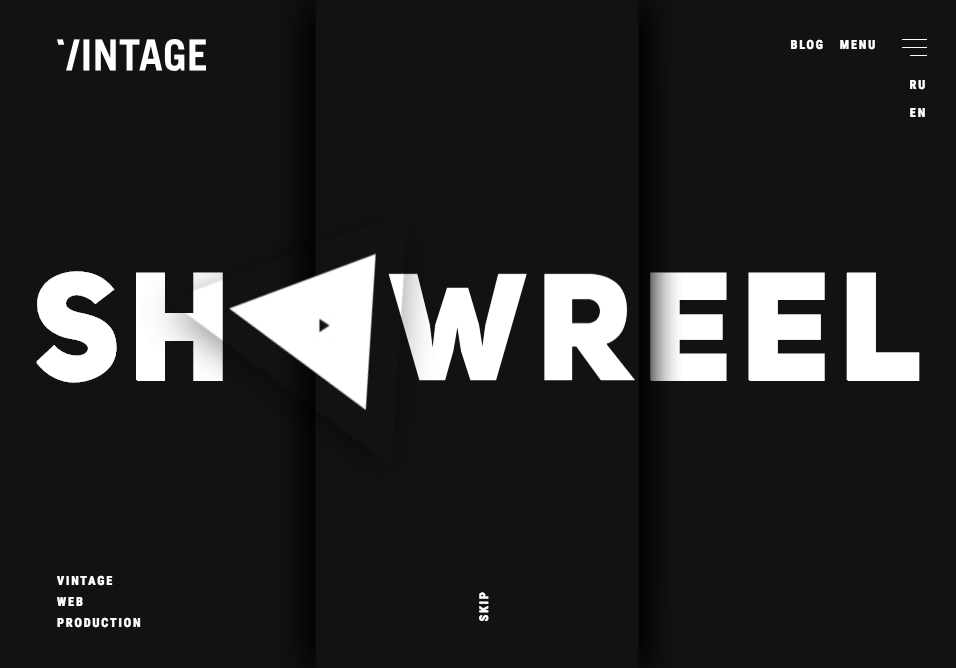
As the capabilities of browsers and devices exponentially increase in 2018, so will the potential for interaction, hotly tipped for this year is the increase in animation and gifs to convey information in the world of interface design.
Tools for designers to incorporate animation into their design process have also made huge leaps forward, for example, Invision announcing the release of Studio this will essentially let designers add timeline animation to their design mockups, bringing them to life. A huge time saver for the designer.
A great example of tasteful interface animation can be seen on the ‘Vintage Agency’ site, it’s subtle and at the same time conveys what their agency is capable of.
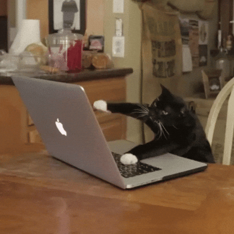
the rise of the gif is going to increase in 2018 with ever-shortening attention spans, the humble gif has become a perfect way for brands and marketers to communicate information succinctly and clearly, the perfect way to creatively communicate compact snippets of information to a large audience efficiently before they lose concentra…oh, look! A cat on a Mac!
Custom illustration
With an estimated 140K websites launched each day, the battle to make your brand stand out as unique and different in a highly competitive world is ever increasing, companies are looking for more ways to enrich their brand experience and connect with their end user.
In recent times we have seen the rise of custom illustrations incorporated into digital interfaces and companies adopting a house style of illustration, many look to team up with an illustrator who will represent their brand. Design agencies are collaborating with illustrators to offer this service in-house, in order to reinforce value in the brand and convey a sense of authenticity.
This year there is an interesting move towards a retro-modern style of illustration, crisp vector lines with a retro colour palette twist, a rebellion against the boring, clean, minimalist approach of illustration in recent years which felt more and more like stock imagery.
Duotones
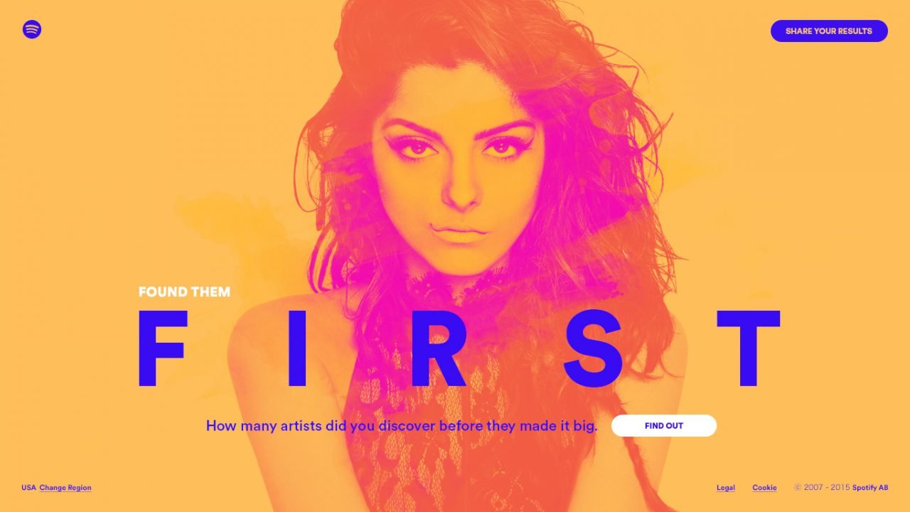
Originating in the printing world, this effect is created by reproducing an image by taking two contrasting colour halftones and superimposing one onto another, the process results in middle tones and highlights being brought out of an image in a unique and striking way. This effect has found a new application in the digital world with duotones, tritones and quadtones being easily created using modern design programs.
This stunning effect was pioneered by Spotify a couple of years back but continues to gain pace and looks like it will be here to stay for 2018.
Design systems
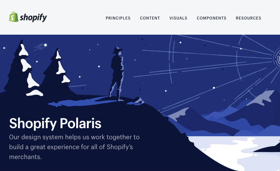
Design systems are not a new innovation but the application of them to how we work is, specifically in the world of digital products.
A design system acts as a sort of living style guide and will allow UI designers, UX designers and developers to collaborate on interface design whilst maintaining design consistency and minimising the risk of design work creeping off brand through the use of a central pattern library, which can include anything from typography and colour palettes, right up to comprehensive interface components such as forms or headers for example. Most well-established brands have their own design system, Shopify’s ‘Polaris’ for instance.
Any of these elements can be nested within another using a design program such as Sketch, allowing designers to update a font, colour or style, effortlessly across a whole site in a matter of seconds.
Designers are opting to use these systems as they allow teams to efficiently craft collaborative design solutions irrespective of scale, allowing digital products to grow without affecting the design budget, appealing to any designer or agency.
To read more about design systems, check out Brad Frost’s book ‘Atomic Design’.
Bold typography
As the legendary designer Paul Rand once said “Typography is an art. Good typography is art” and 2018 looks to confidently reinforce those words with big, beautiful, bold typography being incorporated into the interface designs of 2018.
Designers used to be a bit wary of getting creative with onscreen typography in order to ensure cross-browser consistency but this is becoming less an less of an issue with the development of competent Type products such as ‘Google Fonts’, which provide a range of well-designed fonts in a multitude of styles. This, coupled with the technological advancements of browsers has resulted in the inclusion of a wide range of fonts being experimented with in interface designs, including serif fonts. No longer must the humble serif be banished to print! So expect 2018 to bring you a stunning range of creative and artistic type experiments for your eyes to feast upon, exciting times.
Storytelling
Storytelling throughout human history has been the primary way in which we empathise, bond and learn from one another. Before the written word, storytelling, often through song would have been the main way that vital knowledge was passed from one generation to the next, stories became ancient priceless knowledge shared with the community, they became things of the spiritual realm, creating strong loyal bonds between the culture who were on the receiving end.
Fast forward a few thousand years and we now exist as a large interconnected species in a highly tech literate, rusty capitalist model however the majority of human beings still belong to loyal tribes, tribes of consumers and brands are the new age deities in an age which promotes individualism as the key to self-worth and value.
A combination of the ease of access to manufacturing, design, online shopping and a healthy consumer base at the touch of a button has meant that the process of getting a brand up and running has become far more efficient, yet way more competitive, so the fight for brand loyalty has had to innovate.
100 years of advertising has meant that consumers, especially the young are savvy to the industry’s usual tricks, they are environmentally conscious, highly loyal to authenticity and value transparency in a world where it’s sometimes hard to distinguish fact from fiction.
Companies are only just awakening to the value of storytelling once again, they are being forced whether they like it or not to be transparent in their supply chains, prove their commitment to the environment and most importantly try to build empathy with their audience through authentic storytelling.
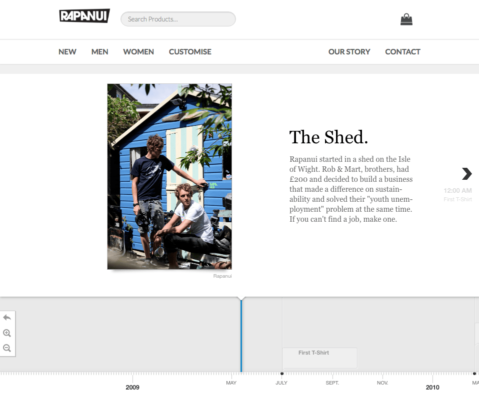
The sustainable clothing brand Rapanui does a great job of storytelling, in my opinion, you feel like you have taken the journey with them, you empathise with their journey and feel part of and loyal to their tribe, purely through authenticity and transparency. So it is up to the designer to bring these brand stories to the surface, a trend we will be seeing more of in 2018.
Brutalism
Brutalism is a term synonymous with Brutalist architecture, the term was coined by British architectural critic Reyner Banham, ‘beton brut’ a term meaning ‘raw concrete’ in French (associated with pioneer modern architect, Le Corbusier) became ‘Brutalism’, encapsulating the rejection of the movement by the people of Britain at the time. Depressingly, even kid’s playgrounds were designed in the style, I feel the musical equivalent would be a Joy Division record.
Monolithic concrete structures started popping up in cities across Europe after the second world war from the mid-to-late 20th century, it had no interest in looking like the superficial architecture of the 30’s & 40’s, it was strictly utilitarian, functional, anti-aesthetic and assertive in nature, celebrating the innovation of the day, concrete.
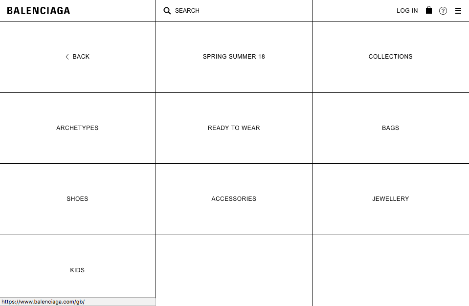
Interestingly, Brutalism has started to become a trend in interface design in 2018, one of the most prestigious and daring examples of this is the site redesign of the high-end fashion brand ‘Balenciaga’, the digital Brutalism movement certainly reflects the principles of the original architectural movement and although it may not be for everybody, it certainly shows confidence and stands out from the crowd by going against the grain, ironically becoming a trend in itself in the process. Is it here to stay? I see no concrete evidence of its longevity just yet!
Bonus: Bitcoin payments
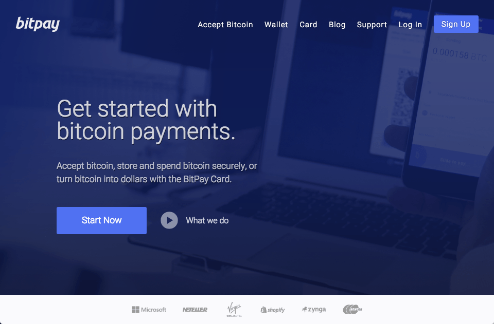
Not a design trend as such but something that is trending and will be affecting the design of commerce interfaces over the next few years, the world of cryptocurrency.
If you haven’t heard about the disruptive tech of cryptocurrency in the world of finance then you must be living off-grid. The digital currency ‘Bitcoin’ has firmly established itself as a credible currency toward the end of 2017 with a meteoric rise to £14K per a coin at it’s highest in mid-December.
This is having a knock-on effect to commence sites with a number of high street names offering ‘Bitpay’ as an option at checkout, the ethical cosmetics company ‘Lush’ for example, which is an exciting development in the world of e-commerce.
Interface designers will increasingly need to consider Bitcoin payments at checkout as cryptocurrencies become more established in the next few years, an interesting time for finance and designers alike!
Now we have seen that some of the potential design trends for 2018, I hope that you have been filled with inspiration for the year ahead. As a designer, it is always important to remember that aesthetic can never supersede function and audience, so it is important to make that a priority before exploring stylistic elements.
I will leave you with a quote from Italian Designer Massimo Vignelli:
“Styles come and go. Good design is a language, not a style.”
Massimo Vignelli